Beyond the Label: The Psychology of Color and Design in Pharmaceutical Supplies
When it comes to pharmaceutical supplies, packaging is not just a container. It is also a safety component and a branding element. And in the healthcare industry, where every detail matters, nothing is more important than pharmaceutical packaging. From a simple pill vial to the pharmacy labels on them, the vial color, the font choice, and the overall design are silent communicators that influence user behavior, perception, and, most importantly, safety. These visual elements allows focus on clarity, compliance, and rapid identification, particularly for high-stress users like patients, caregivers, and medical staff.
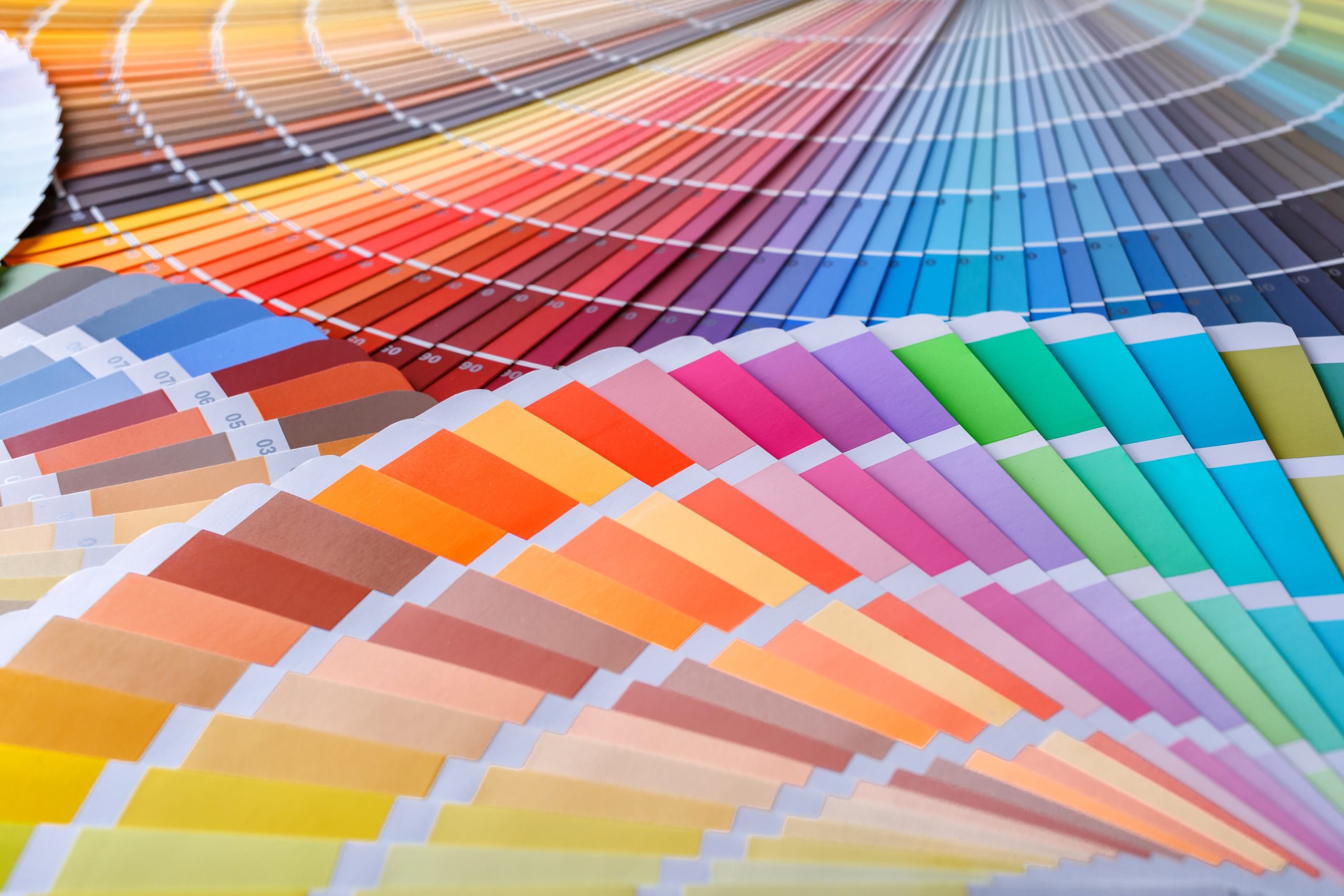
The Emotional Language of Color Psychology
Color is the fastest way the human brain processes information. In pharmaceutical and medical supplies, color is intentionally leveraged for instant communication and emotional connection. This is where colored pill vials and custom product packaging truly shine.
Red – The Signal for Emergency and Caution: Red is universally associated with warnings, danger, and immediate action. In packaging, a red label or a red cap on an injectable vial signifies caution, like a high-alert medication, a high-concentration dose, or an item requiring immediate attention in an emergency. The use of red triggers heightened sensory processing, minimizing the chance of overlook.
Blue and Green – Trust, Calm, and Safety: These colors are often used for general-purpose medications, nutritional supplements, or low-risk supplies. Blue suggests trust and stability. While green often implies natural, organic, or wellness-focused products.
Custom Colors for Awareness – The Pink Vial: Beyond warnings, color can serve as a powerful identifier for awareness campaigns and quick access. A prime example is the use of pink for items or packaging related to breast cancer treatment or awareness. Similarly, specific colors are often assigned to different drug classes or dose strengths for institutional use, preventing medication errors during rapid dispensing.
Design for Clarity, Mandating Safety
The Custom design in pharmaceutical packaging provides safety through clarity. Every design choice must prioritize readability and intuitive use.
Readability is Non-Negotiable: Labels must use readable fonts, typically sans-serif fonts, that are clean, distinct, and lack decorative elements that can distort letter recognition. It is also important to have a high contrast between the font color to ensure the label can be read quickly under various lighting conditions.
The Hierarchy of Information: Effective label design uses visual hierarchy to communicate the most important details first. The drug name and dosage must be the largest and most prominent features, followed by critical instructions and warnings. Custom artwork or brand logos must be minimal and never interfere with the core safety information.
Designing for Every User
Pharmaceuticals are used by individuals of all ages and abilities, making accessibility crucial. The aging population presents a unique set of design challenges that must be addressed to maintain compliance and independence.
Larger Fonts for Older Individuals: As vision declines with age, label text must be significantly larger than average. The contrast must be enhanced, and sometimes, an additional tactile element, such as raised print or braille, is necessary.
Non-Glaring Finishes: Glossy packaging, while visually appealing, can create glare that makes reading difficult, especially for seniors. Matte or non-glare finishes are encouraged to ensure legibility under direct light.
User-Friendly Function: Design also extends to physical function. There is debate over child-proof caps versus ease-of-use for older adults is ongoing. Packaging needs to be simple to open for those with arthritis or limited dexterity but also provide the necessary safeguards for child safety.
Let Samuels Products Provide Your Custom Products
Pharmaceutical packaging is a powerful piece of communication. When executed correctly, it leverages color psychology, clarity-driven design, and accessibility principles, to turn a simple container into an active tool for patient safety, adherence, and confidence in their care. Let Samuels Products be your single-source supplier for all your prescription packaging needs. With quick turnaround and delivery on pill cards, vials and custom printed labels, we help maintain your business’ success and continuity. Samuels Products’ customer service representatives can work with you to develop the best plan for your pharmacy packaging materials to ensure you place your orders early, so you are prepared for all your customers’ needs.